Evolving the Virtual School Library, Part 1: Deconstructing my own interface by Joyce Kasman Valenza

Tools and ideas to transform education. Sign up below.
You are now subscribed
Your newsletter sign-up was successful
Here's what I believe:
A teacher librarian should be his or her school's instructional CIO. Especially as more of our schools move to one-to-one, a virtual library is an essential component of school library practice, and of the school's learning culture.
Through their library websites, librarians can apply and translate their traditional skills for instruction, professional development, reference, collection development, and administration in powerful new ways, in engaging new landscapes. They can offer 24/7 accessibility and just-in-time, just-for-me learning opportunities. As scalable strategies, school library websites allow librarians to guide unlimited numbers of learners in they journeys to become effective users and creators of ideas and information.
Article continues belowMy own virtual library story:
When the Web began, it quickly occurred to me that my service, as well as my instruction, could be more effective and better scaled if our library had two front doors. So, with the help of a few student volunteers, I launched our first primitive virtual library back in 1996. Creating that site was a pivotal point in my practice. It changed the way our library did business, the way I presented and shared instruction, the way students, teachers and parents used and viewed library.
Our virtual library became our second front door. And our statistics told us that door was opening all the time--before, during, and after school, weekdays and weekends and summer vacation. Learners were using the tools we shared at all hours of the day and night.
That original html site underwent major revisions over the years,
Tools and ideas to transform education. Sign up below.
But although it was heavily used, for me it began to seem a little creaky.
Our second front door wasn't opening wide enough. It didn't allow for a truly open flow of traffic.
Over the past couple of years, I grew tired of the limits an html site represented to me. I grew tired of ftping.
The site I maintained did not offer the flexibility or the interactivity that defines the Read/Write Web, Web 2.0, 3.0. (Whatever!)
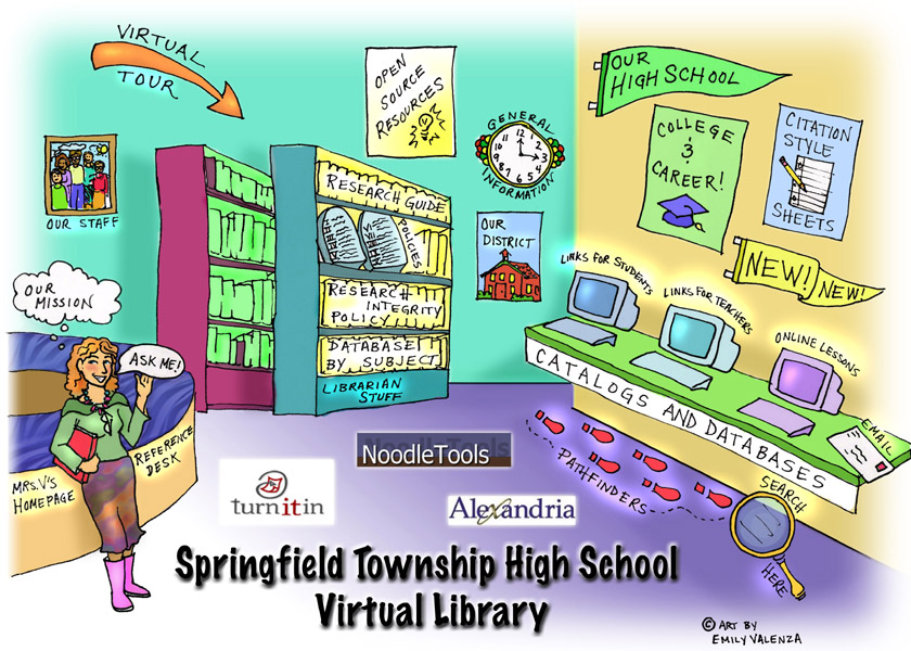
Our site was so 90s. It needed to be liberated! The door needed to open in more than one direction.
Opening the door:
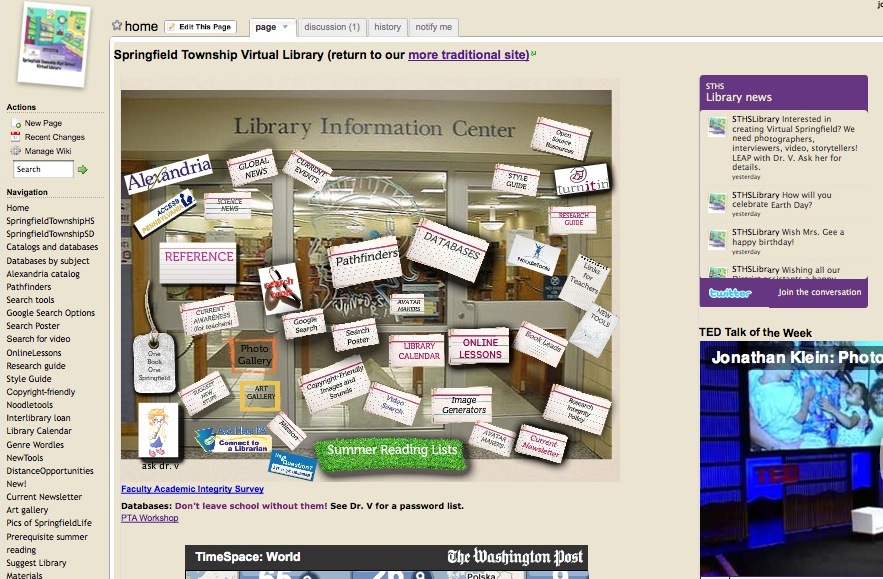
So, back in September, I launched a completely new site, a site that now allows me to combine all the cool apps I continue to discover into a far more creative, effective whole, helping me to achieve my goal of ensuring that our learners are effective users [and producers or creators] of ideas and information. (Note that I feel strongly about adding the word producers to AASL's long-standing mission statement. To use is not enough, but that is a story for another article.)
New site:
Old site:

The goals for my own virtual shift were:
1. to create a more interactive, collaborative presence--to let learners and teachers in
2. to be able to easily create instruction with colleagues and learners
3. to create an interface I could easily edit and update without having to ftp--to be able to move the furniture around whenever the spirit on need hit me
4. to model the use of new information and communication tools for learners and teachers
5. to be able to easily archive and celebrate student work, student art, student life
6. to create a school information hub
Our Virtual Library is now a mashup of a variety of tools.Logistically, it embraces two critical 2.0 concepts:
1. Most of the growing number of available apps play super-well together. It's all a kind of jigsaw puzzle. And, in this particular puzzle, all the pieces want to want to fit themselves into each other. And so, as I will later illustrate by a little tour, the completed puzzle can morph in a myriad of beautiful ways. There is no one right configuration. You can create anything with your pieces. This is called a mashup. Learning needs and local relevance should drive the choices.
2. A number of handy-dandy parking lots not only allow you to park your media, they also give you the lovely gift of embed code, so that you can park your media anywhere else for free. These parking lots are called the cloud. We tend to park our media in spaces like SlideShare and Flickr and video portals like TeacherTube and YouTube, and we grab code like crazy.
Though I generally resist sharing our site as a model--it is still very much a messy work in progress--I do think it may be valuable to deconstruct the building elements behind our second front door.
Deconstructing the evolving site:
In creating our own Virtual Library, I chose to aggregate the following pieces:
- Wikispaces for Teachers is my current basic building platform. For me and many of my colleagues, wikis are as ubiquitous and elemental as pencils. I chose to use a wiki over a blog for my main canvas because I wanted a stable front page for my interface, one that wasn't continually superseded by newer content. Wikispaces for Teachers is free and ad-free for K12 purposes. We use wikis as a platform for access to our pathfinders and databases. Our students create research wikis to store their work (Here's an example of Suzannah's current project ), media, reflections, sources and document their research journeys.
- I used Glogster for our dynamic image map and for our new search posters. (See our Google Search Options poster.) It has replaced the trifold for student research poster projects and is used by students to create interactive indexes for multipage wikis.
- PollDaddy hosts our genre polls. You may want to choose any of a number other equally effective polling tools. In fact, I am using Google Forms for our Current Awareness service, and for our Materials Suggestion form, as well as our Academic Integrity survey.
- I use a Google Docs template for newsletters and other communications.
- I use Google Sites for my resume and some of my student use it as an option for building research projects
- I used Picnik to create that little snapshot logo in the left corner of the wiki. But we continuously play with other image editors, Image Generators, Avatar Makers, and Concept Mapping tools
- My student volunteer, Caroline, created our genre posters using Wordle.
- To create our database widgets, I used these pages:
- EBSCO Searchbox Builder
- Gale Widgets
- Gale Publication Search Widget
- Facts on File Widgets
- Alternate Facts on File Widgets (works better on wikis and blogs)
- ProQuest Search Widget Creator
- JSTOR Search
- WilsonWeb Widgets
- Our heavily used pathfinders come in a variety of flavors. Some are wikis. Among the most popular is our Copyright Friendly pathfinder, used predominantly for student media production. I've chosen to create individual wikis to acommodate multiple pages and to avoid confusing hierarchies as our pathfinders grow. (Some of the links on the nav bars are pages; others are links to other related wikis within our site.) The more newsy of our pathfinders are PageFlakes. More dynamic in platform, they aggregate and broadcast the many newsfeeds our students don't even know they need. The Anything Flake allows me to paste code from third-party sources and the Bookmark Flake allows me to include links to databases, textbooks, and anything else not yet widgetized. Currently, I am a little disappointed by PageFlakes' increasing number of ads. Many librarians effectively use the alternate NetVibes for creating dynamic pathfinders. LibGuides is a popular subscription option and I plan to migrant my more dynamic pathfinders to this growing library community this coming fall. (See Buffy Hamilton's post on LibGuides.) All this information portal activity is designed to model for learners how they might create portals to organize their own information lives. (Explore a few more personal information portal options.)
- I am beginning to incorporate Google Custom Search engines in our pathfinders. See the one we embedded in our Primary Source Pathfinder. It saves time and eliminates noise by searching only the major portals for primary sources.
- I love that I can easily include widgets for new books. Using Google Books' very easy link button (look at the top right of the page after you open a book), we host the new Classic of the Week, as well as the current One Book One Springfield read, as well as any of a variety of assorted bookshelf widgets.
- I chose the Washington Post TimeSpace Widgets for its dynamic, visual news feed. Many other news feed options are available. I also chose a local feed.
- I've played with both the Twitter Profile Widget and Twidget to make local library announcements.
- I am using both FlickrSlider and Flickr's own very easy RSS functions to embed image sets and groups from our highly popular Springfield Life and Art Galleries.
- If you dig really deep down on our pages, you'll see that I've used Slideshare to embed presentations into our lessons.
- I've used a variety of Nings to park video and grab embed code for our News Broadcasts and online lessons and book trailers. We also use Nings to host class discussions and lit circles and our OneBookOneSpringfield events. (Sorry, many of these are protected.) With Ning becoming a pay service, we are investigating some alternatives and planning to fund some of our more critical existing Nings, including our new Virtual Springfield project, which will engage students in collecting images, primary sources, and oral histories relating to their community's rich heritage.
- Many of our archived student projects were created using digital storytelling tools like Voicethread and Animoto and a variety of video creation tools, as well as cartoon making tools. Nearly all of these new tools offer lovely embed code. For examples, check out our wiki museums of World History artifacts and German art, Civil Rights VoiceThreads, and Hamlet soliloquoies. And the WallWisher feedback for our sitcom analysis project.
- Our Google calendar allows us to easily edit and share our library schedule.
Touring effective practice
I am not alone in my excitement over applying new mash-up and publishing opportunities, as well as new learning apps, to library practice.SchoolLibraryWebsites is a collection of self-nominated exemplars of effective practice. The goal is to celebrate effective examples of web-based practice in all their variety.
As you examine the lists of sites, you'll discover that, though there may be fifty ways to leave your lover, there are likely a zillion different new ways to mashup a school library website. (Also take a look at New Tools Workshop and Assorted Widgets for some of the many building block options.)
In the next two posts we'll share exemplars of effective school library websites first at the high school level and then at the middle and elementary levels.
More resources on school library web presence:
- School Library Websites: A Wiki of Effective Practice
- TL Virtual Cafe: Elluminate session on Web presence
- SchoolLibraries.net
- Joyce's Blog
- TeacherLibrarianNing
This series of posts is based on an article originally published as: Tag Team Tech: Evolving the Virtual School Library, Deconstructing the Essentials, eVOYA, Apr. 2010
