First Impressions on the New #GoogleSites


For the most part, Google has eliminated the save button. It’s made real time editing the standard. And it’s made out online navigation quick and easy. Except for Sites.
As any Google Sites user can tell you, it just doesn’t always make a lot of sense. There are too many menus, confusing navigation tools, and you need to click save at every step. It’s a powerful tool, but convoluted and inconsistent with the rest of the G Suite (formerly Google Apps for Education) product line.
That’s why it was great news for everyone when Google announced the brand new Google Sites. More a new product than update, there’s a lot to like in the New Sites. But like any new product, it’s not perfect--there’s a lot I like and a lot of room for improvement.
I avoided the New Sites for a while, and only started playing this week. I wanted to hear some feedback first, and hoped to explore with a more robust and developed version. There’s so much potential--particularly for students--and it’s important to remember that these are just my first impressions. I look forward to coming back with more thoughts after I’ve gotten to build some New Sites of my own.
First Impressions
I played for an hour or two: created, edited, uploaded, and more. In that time, I started to design and create a new version of theeducationcalendar.com to see how it would hold up on the New Sites. Overall, I was happy, and here’s what I noticed:
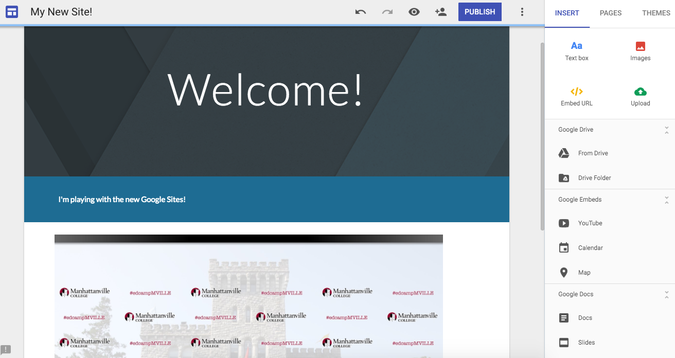
Simplicity. Where the old Sites had confusing menus and options, the New Sites is so simple, logical, and obvious. The menus and options are easy to find, and the whole navigation now allows for real-time collaboration and drag-and-drop editing, two huge improvements. It’s simple, sleek, and effective. But maybe too much so. Besides adding a new page, uploading images, changing stock themes, and inserting Google Drive files, there’s not much to it. There’s almost nothing else you can do with the new sites, making it really good at being simple, but limited in doing much more.
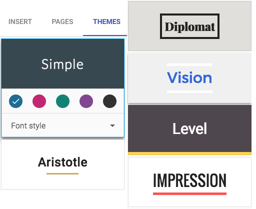
Themes Aren’t Enough. The basic themes are nice, with some limited font and color options, but I want so much more. Why can’t I add Google fonts? New colors? Move images side-by-side? Make things wider without being taller? Add columns? The New Sites is new, sure, but it’s not just limited in function, but in form. I want to do more.
Tools and ideas to transform education. Sign up below.
The themes currently offered in the New Sites.

What’s Next? The needs for the future are clear for me: the New Sites needs to not only support more customization in look to make it a more robust platform, but in tools. Making it easy to embed a website is great, but I would love to see some integration of add-ons or an evolution of widgets. We need to API, documentation, and tools to open up the New Sites to both the average user and the script builders community. Like with many other Google Apps, together we can do so much more.
Great GAFE! For a GAFE user or school, adding resources from Google--in virtually any file type--is super easy. My class’s site, on the old Google Sites, is basically a static web page filled with embedded Google Docs that live update. Creating pages like this is definitely easier, and seems to be a priority for the platform.
The editing mode for the New Google Sites.

Potential for Portfolios
My final thought regarding the New Sites isn’t about me, but about my students. For a power user, it’s simply not robust enough for what I want it to be, and that’s okay. Not every product, tool, or tech can or should work for everyone.
But for my students? This is perfect. I still want (and want them) to be able to customize the look, but the ease of GAFE integration and creation, along with the simplicity of design, makes the New Sites a winner for any age. I can imagine elementary students creating their portfolios without a problem, and would guess that my high schoolers will need little-to-no direction. Without a real learning curve, the New Google Sites is a powerful tool for student publishing, portfolios, and more.
I hope that Google will continue to develop the brand new platform to help it live up to it’s potential and meet the needs of students and educators. Until then, I’ll continue to explore both the new and old, choosing the tool that’s best for to meet by purpose and objectives. Neither is perfect, but they make a power combination for app-smashing and creation.
Have you explored the New Sites? What are your first impressions? Share your thoughts in the comments or on Twitter @MrSchoenbart.
cross posted at www.aschoenbart.com
Adam Schoenbart is a high school English teacher, Google Education Trainer, and EdD candidate in Educational Leadership. He teaches grades 10-12 in a 1:1 Chromebook classroom at Ossining High School in Westchester County, NY and received the 2014 LHRIC Teacher Pioneer Award for innovative uses of technology that change teaching and learning. Read more at The SchoenBlog and connect on Twitter @MrSchoenbart.
