NOT YOUR GRANDFATHER’S LIBRARY
TALKING ENCOURAGED
When Sheri McNair, library media specialist at James I. O’Neill High School in Highland Falls, NY, came to her district four years ago, she stepped into a very traditional space that was mostly taken up by free-standing stacks of books, traditional wooden tables, and eight computers that “needed to go,” she laughs.
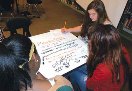
Talking and collaborating are encouraged at the James I. O’Neill High School library. McNair quickly realized that she was spending most of her time scraping the heavy wooden desks across the floor, rearranging the space to encourage classes to come in. So the first thing she did was move the freestanding stacks. “I put the books around the perimeter, which opened up a ton of space. Instant improvement!”
Over the next three years, McNair completely renovated the space, adding carpet tiles, rolling chairs and tables with whiteboard tops, 50 computers, and 60 Samsung Chromebooks. She converted an old classroom into an innovation room by attaching white frosted acrylic panels to three walls and adding pub tables, chairs, banquettes, a TV, and acoustic panels. There are mini makerspace stations with Legos and craft materials, board games, puzzles, a SMART Board, and an 80-inch monitor that’s used for movie nights.
“I inherited an outdated space with lots of rules—no talking, no food, no backpacks, no devices,” says McNair. “Now it’s a multifunctional space where students socialize and collaborate. They bring their lunch and their work. It’s their library.”
Need any proof that a library transformation is worth the time and money? In 2011–12, the year before McNair came on board, students chose to visit the library during study halls, lunch, and after school a total of 6,784 times. Last year, after the library was renovated, students came to the library, on their own time, a total of 24,610 times.
A TRANSPARENT LEARNING COMMONS
When Westlake High School in Austin, TX, modernized its library in 2008, the goal was to create a transparent library so that everyone could see the learning that was going on, says librarian Carolyn Foote. That’s why all of the exterior (and most of the interior) walls are made of glass. In addition, the idea of making the space interactive drove most of the design decisions—including magnetic poetry on the front desk and a whiteboard on wheels.
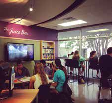
At the Westlake Learning Commons, creativity is celebrated. There’s also a cafe area where students can eat, hang out, and study. The students voted to call it the Juice Bar, and they can get their iPads repaired there as well. (Westlake is a 1:1 iPad high school.) There’s an Apple TV, charging areas, and bar seating.
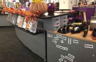
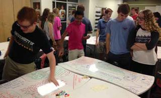
As a proponent of the learning commons movement, Foote made sure to provide offices for the instructional partners who work with teachers. “With all of the different people who work with students and teachers in the same place, it’s easier to collaborate. It’s the anti-silo,” she says.
Updates in a computer lab with laptops included curved VS whiteboard tables that can nest together and glass whiteboards on the walls. “Now it’s a brainstorm/project space and a laptop lab. Teachers and students can arrange the room however they want,” says Foote.
Instead of having a makerspace area, the library hosts makerspace events, including a Play-Doh Day and a 3D printer demo by a robotics team. “A library is a place to go for programming so you can prepare students for the libraries in their future.”
SLEEK, STYLISH, AND USEFUL
In 2012, Immaculata-La Salle High School in Miami, FL, launched a 1:1 iPad program and a STEAM concentration. Within three months, it became obvious that the classrooms and library would need to be updated. “The furniture in our library and classrooms would not allow for collaboration, so I started looking at learning spaces,” says Fredy Padovan, dean of innovation and technology.
Project work is easy (and fun!) in the Immaculata-La Salle High School library. The school worked with Steelcase to create a classroom in which all surfaces are treated with whiteboard paint. The teacher was able to move around and change the way she taught; students were alert and engaged. “It ignited a movement to remodel all learning spaces by 2018–19. We’re about halfway done,” says Padovan.
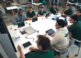
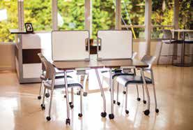
Because the library sits in the middle of the 14-acre campus, it needed to be a functional space that teachers could use for a variety of purposes and with quick transitions. They created two media:scape rooms (a Steelcase design) to hold classes of 14 and 21. These rooms have writeable glass walls and U-shaped seating to encourage collaboration. There’s an area with flexible tables and chairs that holds up to 65 people and a presentation area with two flat-screen TVs and couches. Another section will become a tech bar this summer, with 12 iMacs for students to use.
In December, a teacher booked the space for a class project. She set up two stations in the presentation area for students to use as resources, had an iBook showing on a main projector, and ran different videos in other areas. Her 30 students were working on a group project, and this layout fit the flow of their investigations and collaboration.
“We took something from 1960 into the current age, and now it looks like a college campus,” says Padovan. “I gave teachers three weeks to label books they couldn’t find electronically and was able to go from 40 bookshelves down to three.”
MCNAIR’S TIPS
● Make things mobile. Putting casters on furniture is an easy, cheap fix.
● Turn tables into whiteboards. Pressure-sensitive sheets and paints aren’t expensive and enable students to write on tables.
● Ask families for donations. Castoffs and garage sales are two great sources for games, Legos, and gently used furniture.
● Little things make a big difference. Paint! Brighten up the space to make it nicer. McNair’s students voted on colors and the library now has teal, plum, and orange walls.
● Automate processes. With Google Apps, students can sign in and out electronically and teachers can book meeting spaces in Google Appointments.
● Don’t be afraid to apply for grants. Two favorite sources: The Institute of Museum and Library Services (imls.gov) and The Meemic Foundation (meemic.com/the-meemic-foundation/grant-opportunities.aspx).
FOOTE’S TIPS
● Make sure the space is student-centered. Even the little things, like a magnetic front desk, convey the message that the space is for the students.
● Observe students to see how they’re using the space. Talk to students; do surveys. That’s how you’ll learn what to do first.
● Use social media to get ideas. There’s great stuff on Twitter and Pinterest, in addition to people to partner with and share ideas. Read blogs and use the power of social media to branch out.
● If it isn’t working, change it up. Foote had armchairs in the juice bar, but once the students got iPads she noticed they were stacking on top of each other to look at their iPads together. She found inexpensive seating cubes online that can be made into an S-shape. She moved the armchairs to another area and now multiple students can sit together on a cube.
PADOVAN’S TIPS
● You need to have buy-in. Take the time to study how the space is currently being used. Which areas are not functional or could be improved? Are students avoiding certain types of chairs?
● Give students choices. Bring in samples of different types of seating and study what the students actually sit in for certain tasks. Choice is important if we want to create independent thinkers and learners.
● One size does not fit all. Each building has unique needs. Spending the time required to identify and meet those needs may mean that your renovation takes six months or longer, but remember: It’s not about a space that looks good—it’s about a space that’s going to be used.
VENDOR LIST
► AGATI Furniture (agati.com)
► Artcobell (artcobell.com)
► Bretford (bretford.com)
► Community Furniture (communityfurniture.com)
► Fatboy (fatboyusa.com/collection/)
► IKEA (ikea.com)
► Interior Systems (isiamerica.com)
► Steelcase (www.steelcaseeducation.com)
► Teknion (teknion.com)
Tech & Learning Newsletter
Tools and ideas to transform education. Sign up below.
