Class Tech Tips: 5 Tips for Creating Infographics with Students
For student consumers and student creators, infographics are an absolute must-have.
Do you use infographics in your classroom? Student readers should be able to gather information from infographics. Student creators should be able to make one. In this blog post, I’ll share five tips for creating infographics with students, along with a few places to find examples. You’ll also hear about a tool you can use in your classroom to help students make infographics this school year.
An infographic presents information in a visual format. I’ve featured infographics in my blog posts before (like this one). You’ve probably come across them in newspaper articles or magazines too. For student consumers and student creators, infographics are an absolute must-have. They communicate information with words, numbers, and visuals. Students should be able to read this type of media, and they can make their own too.
Creating Infographics with Students
Below, you’ll find five tips for creating infographics with students this school year. I mention these free graphic organizers, which include a keyword search activity. I also give a shout out to select features in Spark Post. Let’s dive into the tips for making infographics and a guide to using Post with students!
Examine Exemplars
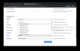
Exemplars help students understand what a product can look like when it is finished. They can also help set expectations for students. You might take a look at a favorite online news source. Or you can search for topic-specific infographics with an Advanced Google search. If you use an Advanced Google search, you may want to include a file type to narrow down your options. For example, infographics are often shared with readers as PDF or JPEG files. So you can toggle in the search bar to choose one of these file types.
Another option is to go to Pinterest. There you can search for infographic boards created by other educators. Here is one board you might find useful. This website from Kids Discover has a few infographic examples you can take a look at too. During whole-class discussions, project the infographic for everyone to see. Do you want students to take a look at them in small groups or partners? Then print out the infographics or send them to a shared folder for students to explore.
Discuss Symbols
An essential component of a strong infographic are symbols or icons. These represent big ideas and should resonate with an audience as soon as they see it. Sometimes these icons become bullets on a list of information. Other times, they are next to a data point to provide some extra emphasis.
Pose questions as you examine exemplars with students. For example, ask them why the creator of an infographic might have chosen a specific icon. You might also ask them what other icons could accomplish the same goal to communicate a point.
Tech & Learning Newsletter
Tools and ideas to transform education. Sign up below.
Brainstorm Keywords
At the bottom of the blog post, I share steps for using Spark Post. I show off the Noun Project’s library of icons. These are accessible from within Spark Post. But of course, you might search for icons using another tool. No matter which platform you decide to use, students will need to do a keyword search.
This set of free graphic organizers includes a keyword search planning page.
You might brainstorm as a whole class search terms related to a specific topic. Alternatively, you might ask students to work with a partner. Together they can list words to help them find a particular type of icon. This strategy can address frustrations students might feel as they search for icons. It can also have them build their vocabulary around a specific topic.
Set a Size
As you examine exemplar with students, they’ll notice lots of things. One thing the most likely notice is that these come in different shapes and sizes. You might decide that you want students to all create a graphic of the same size. This could be because you want students to share it in a consistent way. Or you might have an idea on how you’re going to publish these for a wider audience.
Of course, you might give students more flexibility. Or you can give them a few choices of sizes to pick from; it’s totally up to you. In Spark Post, there is the option to choose a size as soon as you get started. Students can also resize the infographic to change the shape in the middle of their project. There is the option to create infographics in multiple sizes by using the resize feature.
Share Big or Small
Like any exciting piece of student work, you want to establish an audience. This audience might be small, just the size of your classroom. Students could post their creations in a shared space like Seesaw or Padlet. Alternatively, students could create infographics based on a data set given by a local organization. Then that organization might review student creations and post on their own platforms.
There is no one way, or right way, to have student share with an audience. I talk about authentic audiences in my book, Tasks Before Apps: Designing Rigorous Learning in a Tech-Rich Classroom. No matter what audience you choose, introduce it to students at the beginning of the project. Establishing an audience is an essential part of providing relevance for students.
Using Spark Post to Create Infographics
In the steps below, I’ll share some tips for creating infographics using Spark Post. If you’re a regular follower of the blog (sign up here) you know I love sharing the Spark tools. Ben Forta and I also have a book titled 40 Ways to Inject Creativity in the Classroom with Adobe Spark. This book shares lots of lesson ideas. Use this link to download graphic organizers to help you get started with Adobe Spark.
Students can access Spark Post from both a web browser on a Chromebook or laptop and an iOS or Android device. The screenshots below show my Chrome browser on my MacBook. However, the features are similar to the mobile app as well.
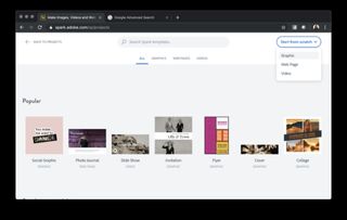
If students use the web version, they’ll have to choose the graphic option, as opposed to Spark Video or Spark Page. You can learn more about using Video and Page in this blog post. Students are first asked to choose a background image and a size for their infographic. Both of which they can change later.
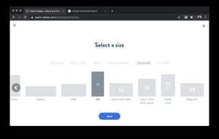
Infographics typically have solid backgrounds. So you may decide to have students choose an image during this first step and delete it later to add a solid background. Or they can press the “skip button at the bottom of the screen.
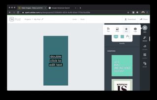
The + at the top right of the screen allows students to add both text and icons. This option is where students can search through the Noun Project to find icons to add to their infographic.
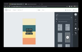
Often infographics have different sections divided by colors or lines. If you choose the layout button, you’ll be able to change the number of segments in the infographic. You can also swap out the colors or add other pictures if you like.
Sharing Student Infographics
Once students have finished their infographic, they can share it as a link for anyone to view. Alternatively, they can download it as a JPEG, PNG, or PDF file. Again, there isn’t just one way to do this. You’ll want to determine how you want students to share their final creation. That will dictate the way that they choose to publish their infographic. Students can download their infographic in multiple formats. This tool gives them lots of options to show off their work with a larger audience.
Download these free graphic organizers which include a keyword brainstorming sheet.
cross posted at classtechtips.com
Dr. Monica Burns is a former classroom teacher, Speaker, and Curriculum & EdTech Consultant. She is the author of Tasks Before Apps (ASCD) and #FormativeTech (Corwin). Visit Monica's site ClassTechTips.com for more ideas on how to become a tech-savvy teacher.
