5 Things You Need to Know About the New and Improved Tech&Learning Website

You may have noticed that things look a little different around here. That’s because we’ve redesigned, re-engineered, and re-organized the Tech&Learning website to make all the great content you’ve come to rely on easier than ever to find and use.
Here’s what’s new:
1. Job-Critical Content
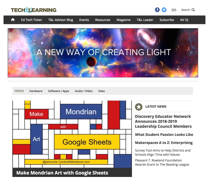
You’ve told us what you want through what you read in our email newsletters and on our website—providing data that helps us understand the topics and formats most valuable to you. In response, we’ve prioritized stories in our "Latest news" section to help you easily access the content most important to you.
2. Faster Download Speed
Your time is important. Tech&Learning is hosted on a new web platform to enable faster page loads, making it more efficient for you to get the content you need.
3. Bolder, More Useful Design
Tools and ideas to transform education. Sign up below.
When you arrive at the new Tech&Learning homepage, you’ll see what’s trending right away. The most important insights are highlighted in a large box of photos, alongside a quick list of the most recent news. Scroll down for more detailed previews of the latest content in each article category—perfect for browsing quickly to see what’s new each day.
4. Better Navigation & Search
Every page features a navigation bar that has been reorganized to showcase the highest-value content. There is also a “more” selection that reveals access to “Resources,” “Events,” “AV-iQ,” and the ability to subscribe to our magazines and email newsletters.
The upper-right corner of every page includes an icon you can click for a much-improved search experience, in which you can find content by headline, author, company name, or technology type, and then further refine results by news or features to find exactly what you’re seeking.
5. More Mobile-Friendly Responsive Design
The number of people using mobile devices for the majority of their online activity continues to grow. With that in mind, we gave the new site a modern, responsive design that adapts to fit a wide variety of screen sizes and resolutions, from smartphones to tablets to laptops to desktops, and even video walls! This ensures a mobile-friendly experience while retaining a traditional view from computer screens, with links to related and trending content on the periphery.
We think you will like what you see. If you have any questions, please contact us! We’re always happy to hear from our audience, and we hope you enjoy this new experience.
