How Data Analytics Allow Districts to See the Change

The power to harness and visualize current, contrasting data across a school district is altering the way administrators and superintendents plan and communicate change.

More data than ever before is being generated by internal resources as well as external sources. The key to using this information is having a tool to pull them together for analysis. By connecting the dots between student characteristics and performance, property records and other data sets with physical addresses, geovisual analytics organize and bring patterns to vivid life. (see also: http://guidek12.com/category/resources/)
Visualization is crucial when tackling issues like boundary change, demographic shifts, referendum planning, open enrollment analysis and program placement. With the majority of the population categorized as visual learners, visual analytics make it easy for decision makers to clearly see answers as well as explain the causes behind changes in policy, and to communicate in ways more people will easily understand.
Geovisual analytics are providing actionable information in easy-to-understand bites that match the visual learning habits of the majority of people, allowing school districts to make informed decisions. Administrators are now able to find patterns, such as analyzing open enrollment trends to visualize where a student lives and where they attend, helping them avoid potential capacity challenges by identifying trends early.
When administrators can see how resource allocation aligns with student dispersion and patterns, programs for special needs populations can be located in the areas of greatest need, and diversity policies such as free and reduced lunch can be properly planned. Creating scenarios for growth or consolidation can be done by those closest to the issues and at a very granular level for impact analysis.
GuideK12 is helping administrators visualize their school districts’ complete stories and show stakeholders the data behind their decisions in a platform that virtually anyone can use. Learn just how easily this tool can improve your decision making and communication.
GuideK12 helps districts find quick answers:
Tools and ideas to transform education. Sign up below.
•What is the impact of these boundary changes? Where is the boundary best located?
•Where are the voters in the community and do they have students?
•Where do the students live and where do they attend? Where are you losing capacity or getting too close on capacity?
•Are the specialized programs placed in the building closest to where the students with the need reside?
•Are there any patterns to understand regarding students not performing well on standardized test and any other factor? What could be done to support those students?
ADDITIONAL RESOURCES
Why Analytics Are Key to Solving Budget Woes
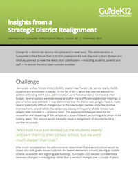
When the Sunnyside Unified School District in Arizona faced a budget shortfall, administrators used geovisual analysis to address the issue strategically and create a solution that benefitted its stakeholders.

How Data Can Influence a Capital Campaign
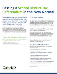
Bond requests to replace aging infrastructure and provide 21st century learning environments can present challenges in today’s tax tolerance climate. See how data visualization can help target the right people with the right messaging.

See also: www.GuideK12.com
